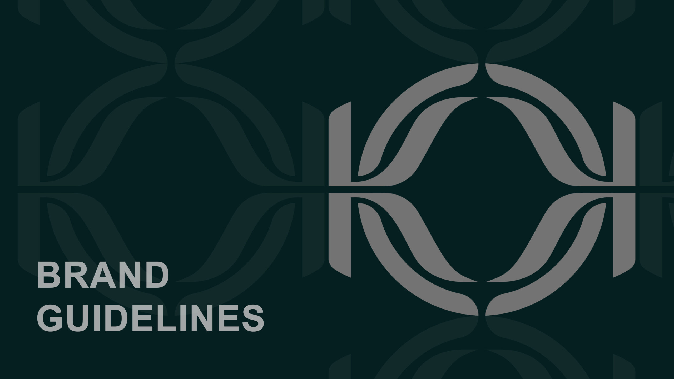
KIACHIC Brand Identity
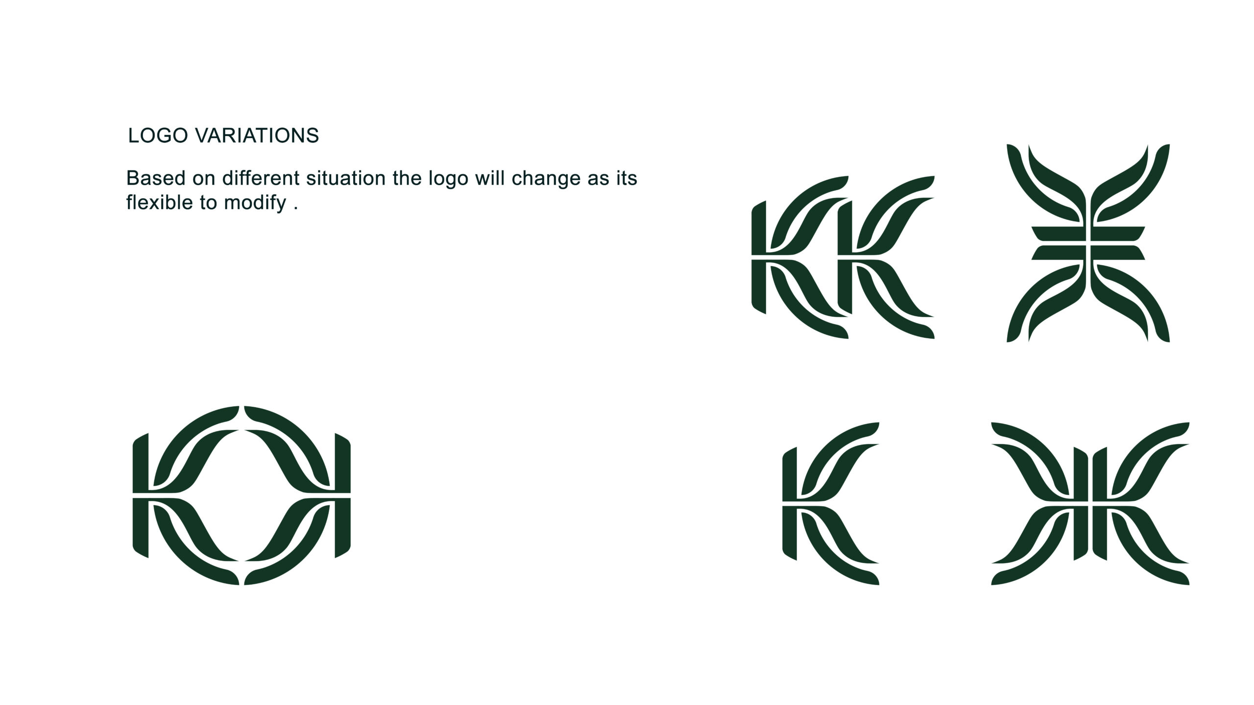
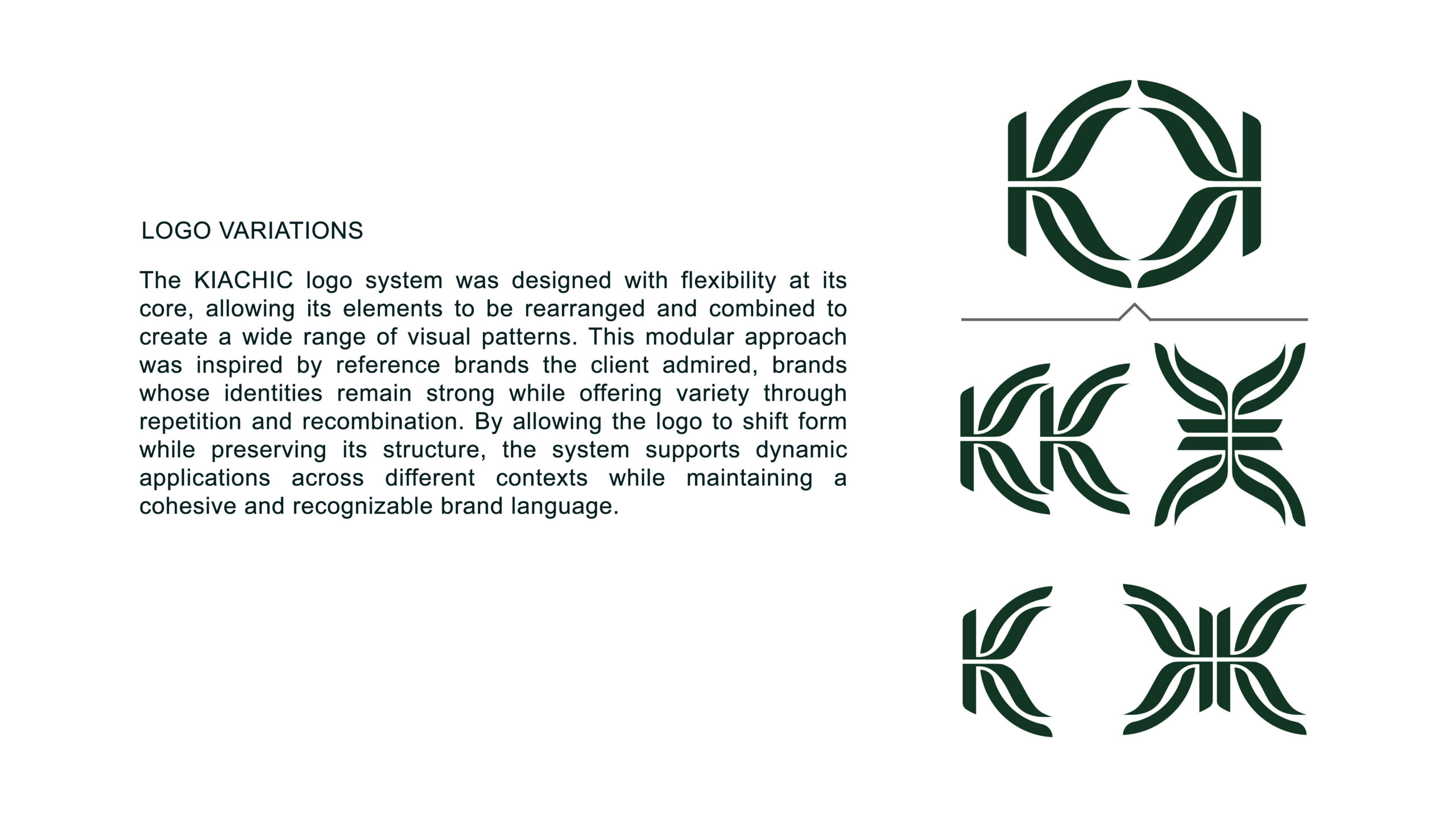
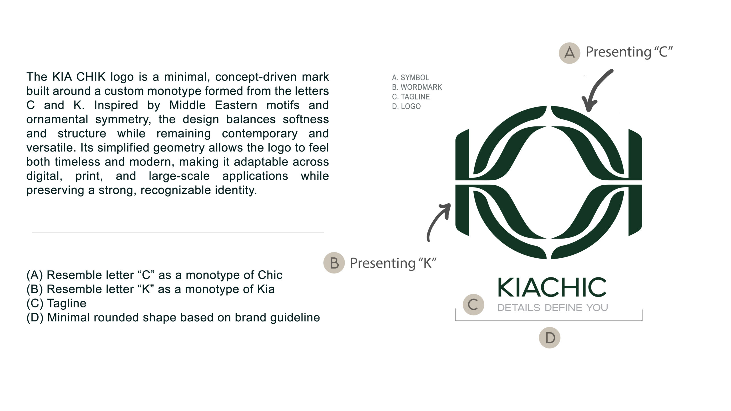
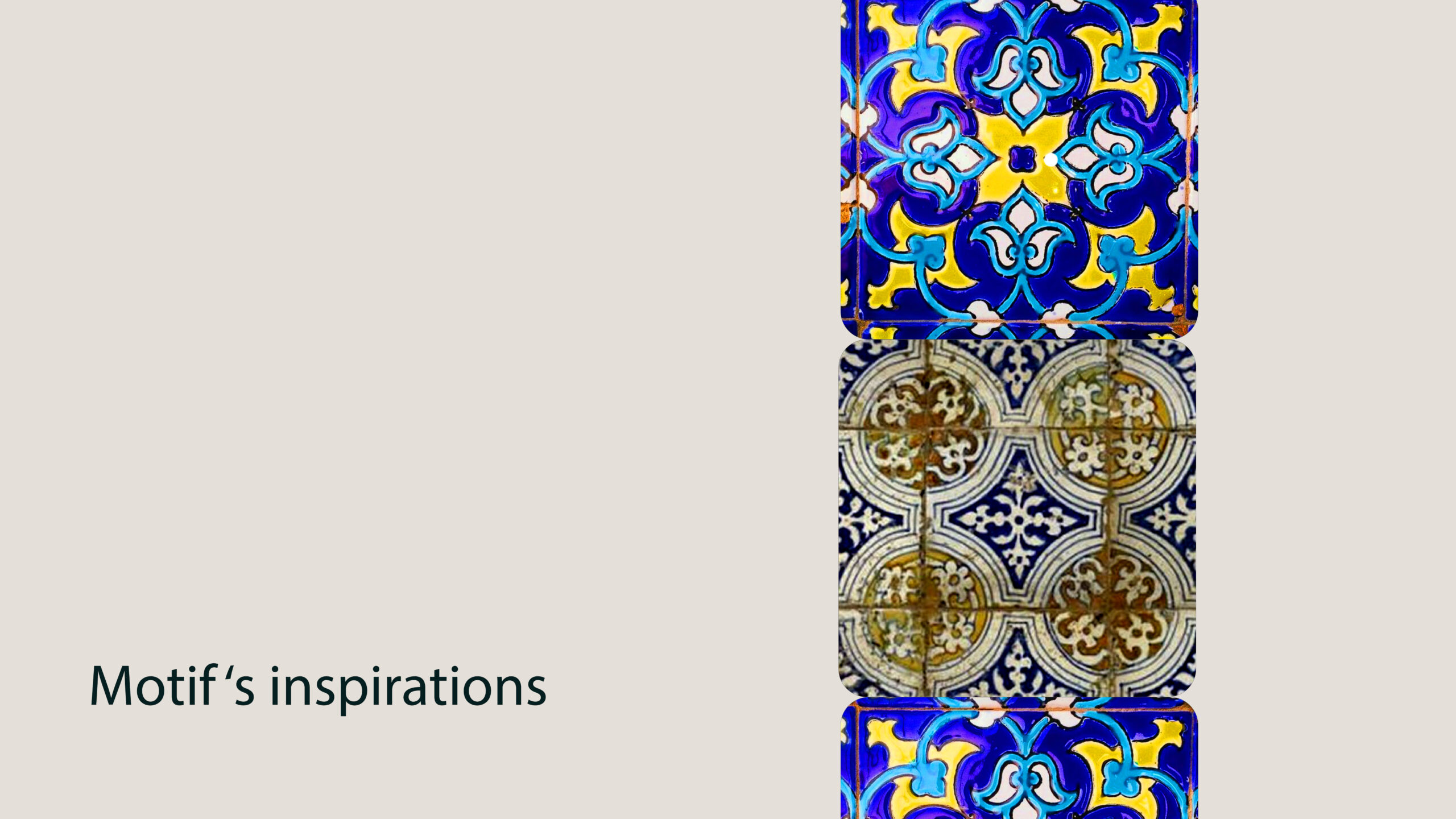
The client requested branding for an accessories line that would appeal to both male and female audiences, incorporating the letters “K” and “C” as a monogram within the typography. They envisioned a flexible identity system—one that could function as a complete logo or be broken down into individual elements for broader brand applications. A strong influence of Middle Eastern art and culture was central to the request, paired with a preference for a clean, minimalist aesthetic.
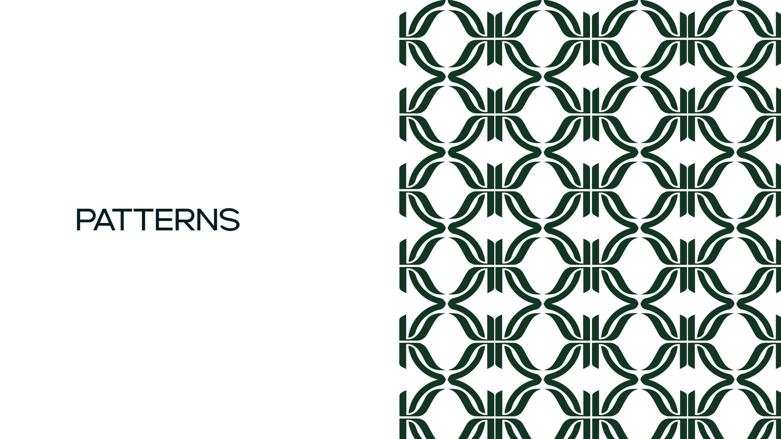
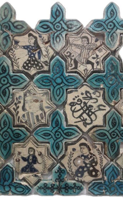
This combination presented an interesting challenge, as traditional Middle Eastern motifs are often highly detailed and complex, while the brand also needed to remain modern, minimal, and versatile. In addition to functioning as a logo, the design had to support multiple iterations as repeatable patterns and be suitable for production methods such as laser cutting, which required precision, clarity, and structural balance.
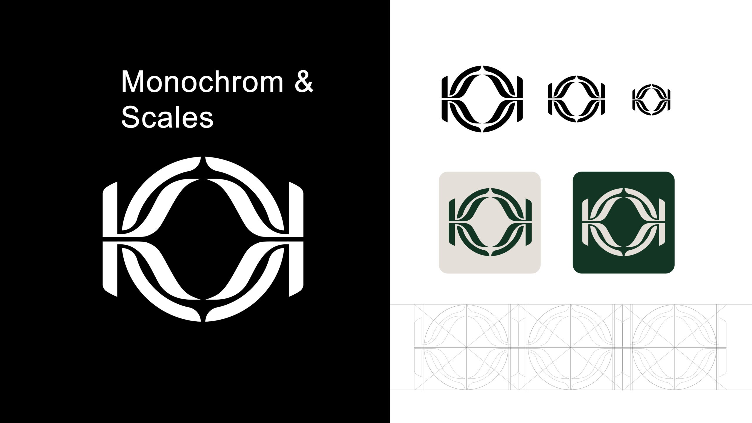
Inspired by Moroccan textile motifs, the final design takes a circular form that subtly evokes softness and femininity, while sharp corners and geometric detailing reflect the precision and strength the client desired. The modular nature of the logo allows it to be deconstructed and reconfigured into various pattern systems, creating a cohesive and dynamic visual language across the brand. The final outcome successfully balanced cultural richness with modern simplicity, resulting in a solution that was both technically functional and visually satisfying, for the client and for me as a designer.